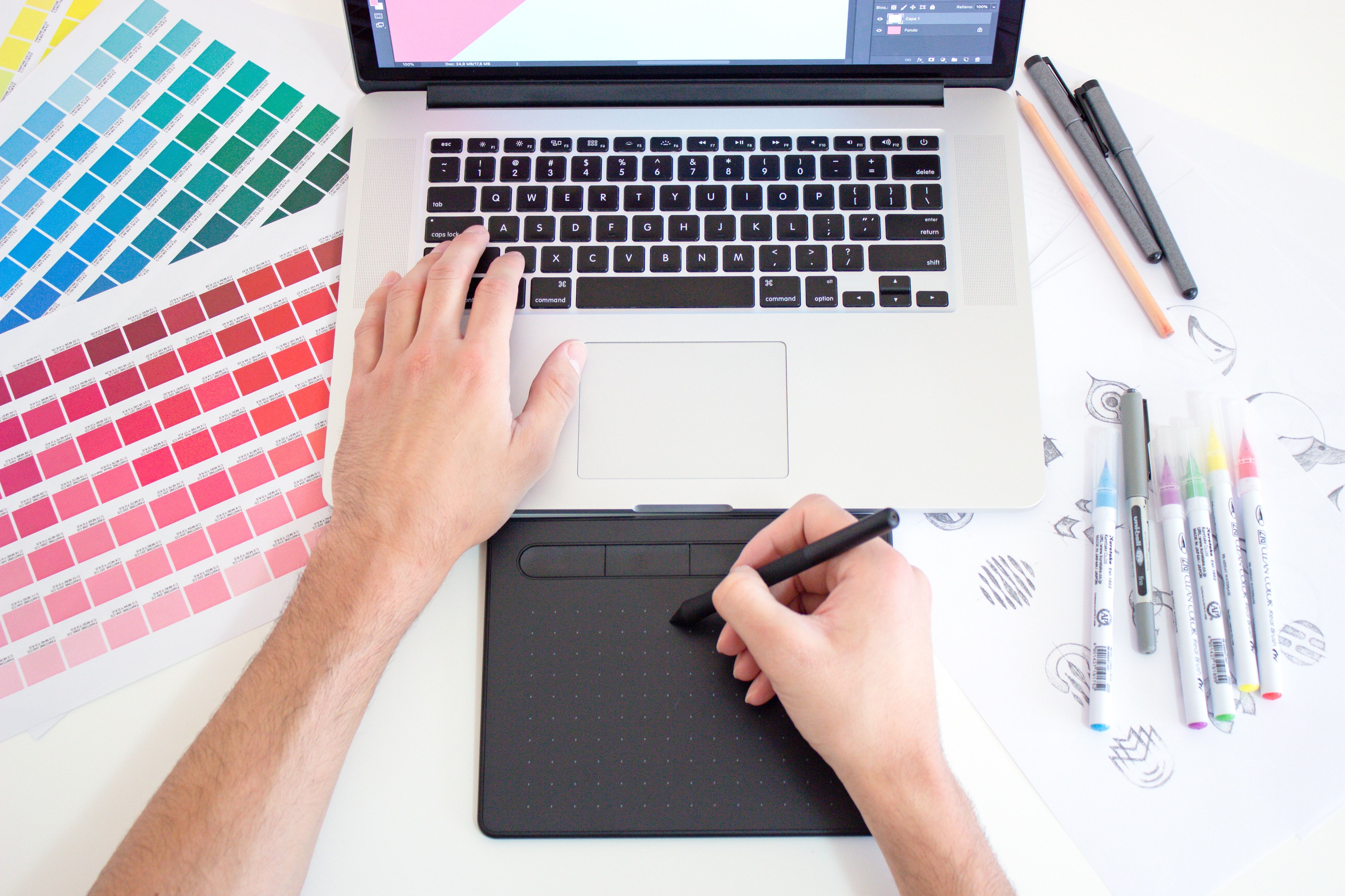
How to design a logo: Tips for creating a timeless identity
Creating a custom logo is a task, different from what creatives and design experts may be used to. It is not only artistic. It has a commercial purpose, and must allow a company or an organization wanting to be known, to create a new identity. Having the right tools and the necessary skills in drawing and communication is a must to create a timeless logo.
The logo, an essential communication tool.
Creating a genuine visual identity, in order to be recognizable and quickly identifiable, is essential for companies, associations, websites, or any organization wanting to be known by the general public. To achieve this, the logotype is the perfect tool to create a brand identity, and the company's logo must correspond to the graphic representation of the company. It is, with the slogan, the most important element in the communication of company, this one having to allow everyone to recognize the brand at first glance, by being memorable by the greatest number. It is all the more important not to rush the graphic creation, at the time of the conception of logo, this one being used on various communication materials, from business cards, to posters, through advertising or Internet sites. That's why the great majority of professional organizations hire a qualified designer working in a communication agency, or a freelance graphic designer, to create the graphic identity of the company, as well as its brand image.
Having the right equipment to get started.
Know the basics of drawing.
In order to create a premium image for the creation of a logo, designers must have a solid background in drawing, and a general and artistic culture, allowing them to find the right idea for their client. The creation of a graphic charter is often carried out by companies. The designer of a logo must then be able to realize his/her drawings in different styles, and know how to adapt his/her sketches to this one. Knowing the techniques of drawing, colorimetry, digital drawing, but also the history of art, in order to create on any subject, and to be inspired by the greatest artists, all this knowledge can help you create more inventive and more striking logos for the target audience.
The graphic software, an indispensable ally.
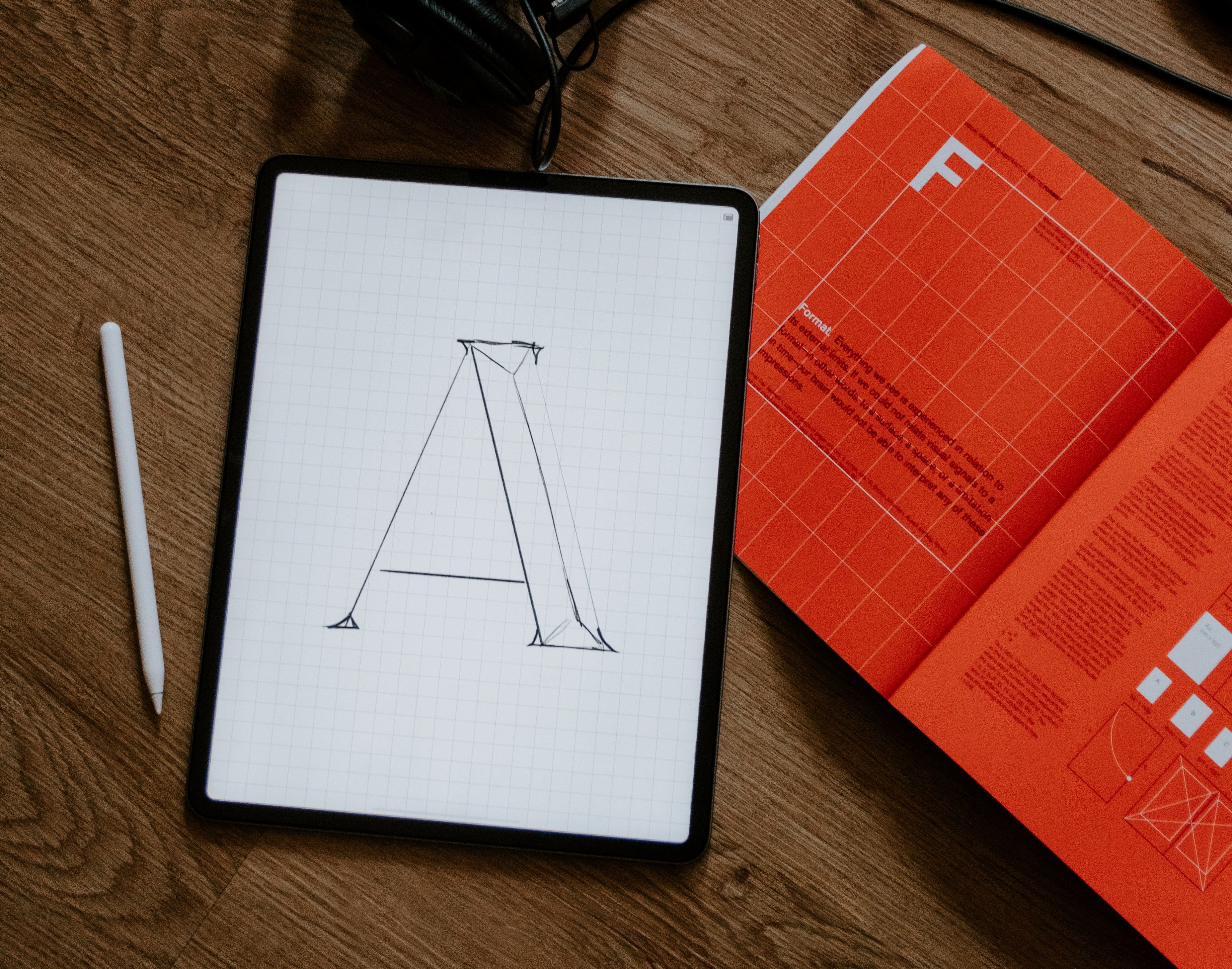
Company logos should be used on any communication medium. Thus, having the right graphic design material is essential to make an original logo, and whose graphic elements will adapt to any situation. The use of a drawing software and a graphic tablet is moreover essential for the graphic designers wishing to create logos on transparent background, usable everywhere, and whose size does not pose any problem. You can create logos with tools like Photoshop or Gimp, which will do their job thanks to their versatility. However, using a vector drawing software like Adobe Illustrator or Inkscape is much more recommended, thanks to the vectorization system they offer. Indeed, since a vector sketch does not use pixels, you can resize your drawing as you wish, without losing quality. The logo created remains in high resolution, regardless of the medium used and its size. The disadvantage with the vector format is the color management, less efficient than with a raster software, using pixels, but, and we will come back to this, the logo creation does not require a great variety in terms of colorization. These softwares are also essential, the management of layers allowing to elaborate each element of your logo, independently from each other, in order to create it faster and more efficiently.
The graphic tablet, an essential aid in the creation of a logo.
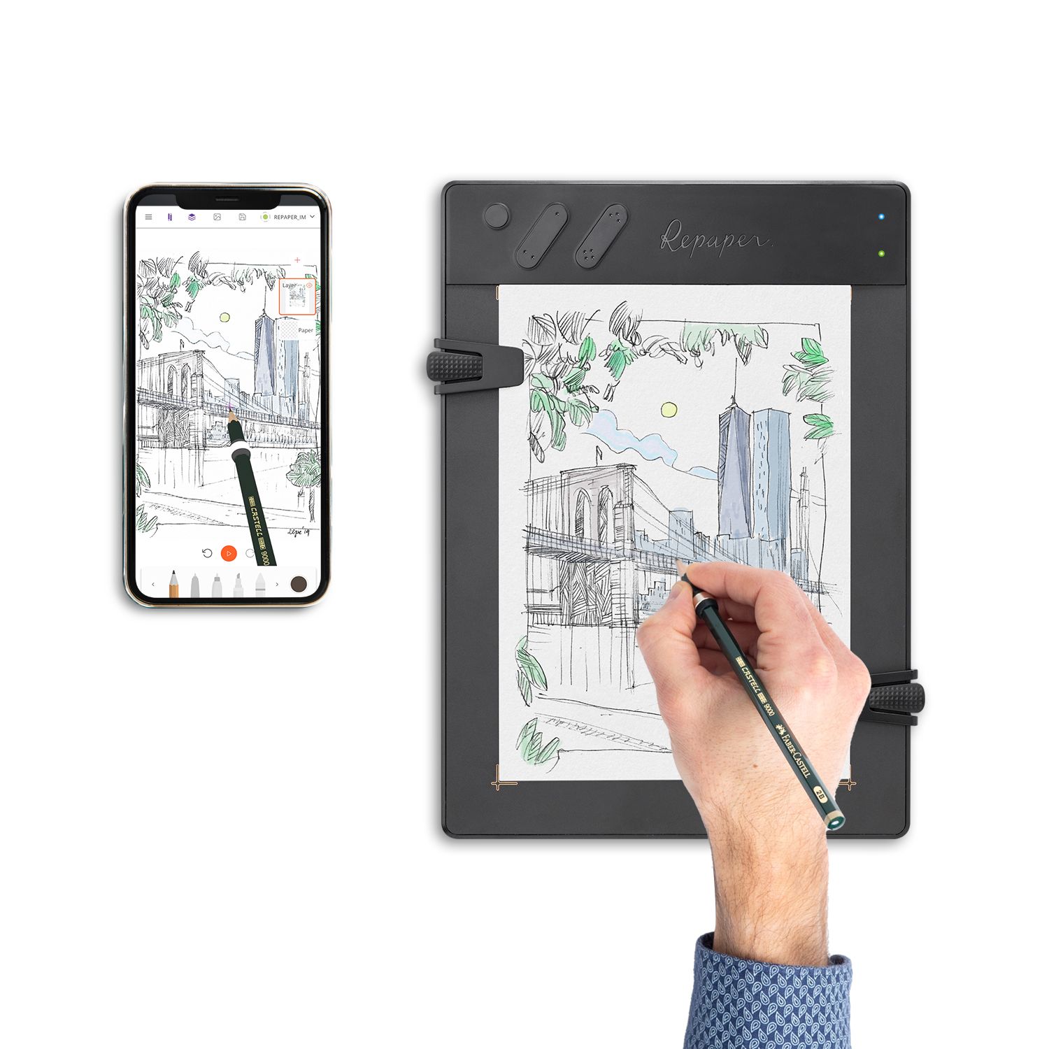
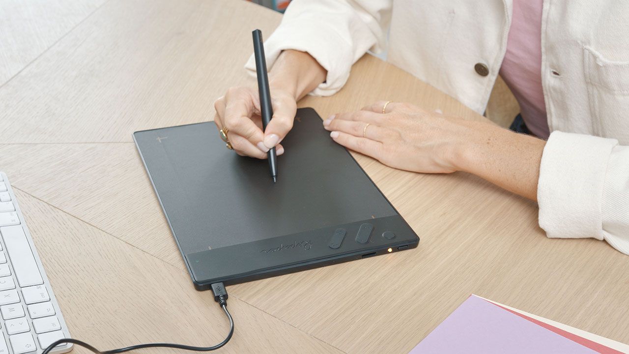
To use these softwares, a graphic tablet is soon essential, the use of the mouse and the keyboard being impossible to realize quality digital drawings. If those working only from their office can opt for a very expensive tablet with display, the majority of graphic designers will opt for those without display, more manageable and transportable, less expensive, but having the disadvantage of having to master hand-eye coordination, the drawing being displayed only on the computer screen, and not directly under the stylus. Moreover, the use of this stylus, and the texture of the work surface can be disturbing for beginners or people who are used to working on paper. For those who still enjoy sketching on a standard sheet of paper prior to working on a computer, or for those who like to work on the go, for example in transit, or who are simply not used to the hand-eye coordination required by a tablet without a screen, a paper tablet, such as the ISKN Repaper, may be the right solution. This kind of versatile graphics tablet allows you to create your sketch directly on a sheet of paper, placed on the work surface, with your favorite pencil, just like on a classic drawing pad. It also allows you to work independently, without a computer, thanks to an integrated memory. All you have to do is transfer your backup to a computer at home and work on your image directly in the graphic design software, just as you would with a graphic tablet without a screen. It's an intuitive design tool, perfect for those on the go who want to draw inspiration from the outdoors to create striking and recognizable logos.

Some tips to create a logo.
Analyze the theme.
Company logos must represent, in a single image, the complete visual identity of the company. Your drawing will have to, in a few pencil strokes, and while respecting the graphic charter of the company, act as a graphic representation of the latter. This can be a graphic transcription of the sector of activity of the structure, the values that it advocates, of a reference in connection with an ideal or a philosophy, or it can be a word, a stylized slogan, with a particular font, or all that at the same time. It is therefore important, when we start designing a custom logo, to analyze everything, to propose a complete and striking work. All the visual communication of the company, the association or any other structure for which you work, will pass by this logotype.
Just draw.
During the design process, all beginners who have already created a logo, already wanted to add details that overwhelm the design. In order to keep your graphic designs from looking outdated and old-fashioned, and to get a modern logo with a strong and timeless visual identity, drawing in a simple, minimalist way, and designing basic shapes, is the solution. We've all seen road or emergency signage. These are simple, effective, and the typography or icons used have the advantage of being easily remembered, and recognizable by anyone watching. This is what we are also looking for with the creation of a logotype. Circles, squares, rectangles, triangles, etc. By using all of these basic geometric figures, and by interweaving them, you will be able to create designs that are powerful, meaningful, and stick in your mind. The same goes for the writing. If the font used to write the name of the company is too "original" and complex, it will weigh down the whole thing, and make it unattractive to the eye of the public. Apple, Microsoft, Nike, Adidas or even WWF and McDonalds, all these examples of logos, which are well known, use simple and incisive fonts and designs. Keeping it simple is not so easy, but it is essential to achieve a logo design that is recognizable by all.

Adopt visible and harmonious colors.
A professional logo, even if its background design is good, must be readable and visible from a distance. That's why the choice of colors is an important step not to be neglected. You can opt for black-and-white, a safe value, but not very original, and if you want color, think about their harmony. As for a drawing, the harmony of colors is essential, and the tones must be mastered. To do this, try not to exceed 3 colors at most, with a bright dominant, an intermediate, and an auxiliary if necessary. Too dull colors are also not advised for a logo, and to use gradations, or effects too marked, besides not being in the air of time, is really a barrier for recognition.
Think outside the box, but be careful not to copy.
When proposing a logo, the designer must show a creative design that will allow his/her client to stand out, and differentiate from competitors, by being the most recognizable of all. The more creative the suggestion, the more effective it will be. It is necessary to avoid being too strongly inspired by existing things, in order to create a new logo, unique, which will participate in the creation of a strong identity. Moreover, it would be a pity to be sued for copyright infringement or for counterfeiting by a competitor, for a simple drawing that will look like it came out of the first logo generator. Take inspiration from nature, from what surrounds you... There are still many ways to explore to create an effective logo.
Beware of double meanings.
Last but not least, when designing logos, pay special attention to double meanings. Having a double meaning in your designs can be the worst kind of communication for a company. If this can be intentional, by integrating a hidden meaning, in accordance with the philosophy of the company, it can also be fortuitous, and be passed through the eyes of the people validating the final result. Having an ostentatious or offensive sign in a logo, without the creators being aware of it, has already happened, and, with the power and speed of the Internet, the variations and mockery have quickly developed on the most visited forums and sites. It is therefore necessary to be vigilant when creating the design of a logo, and organizing a brainstorming, with independent people, can be a good idea to reflect on what is and is not in your creation.
Conclusion.
The creation of logos requires strong graphic skills, in conventional drawing as well as digital. Logos must be suitable for all media, and for that, using drawing software will be essential for the logo designer. If you are not used to digital, a graphic tablet can help you to succeed. You will have however to quickly master drawing on computer, illustrations being necessary to create a strong visual identity, and the graphic coherence being of stake to obtain a result up to customer expectations.

Discover more
How to become an illustrator?
Working in the field of illustration is a dream for many enthusiasts. If the artistic part found in the job of a comic book or manga artist, or the illustration, are the first thing you think of when you talk about making drawing your job, there are many choices you can make for your career.
Get into creative businesses.
It is important to realize that choosing a creative profession is first and foremost choosing a profession that you are passionate about.
How to draw in 3D or in perspective?
Discover how to draw in three dimensions, and explore the different techniques used for 3D perspectives.
Newsletter
Keep up to date with iskn news and events
Free standard delivery
for purchase over €80
30-day returns
on all products
Secure payment
with Stripe & PayPal
Pay in 3
with Alma
Customer service
chat with us


